MCMARKETS
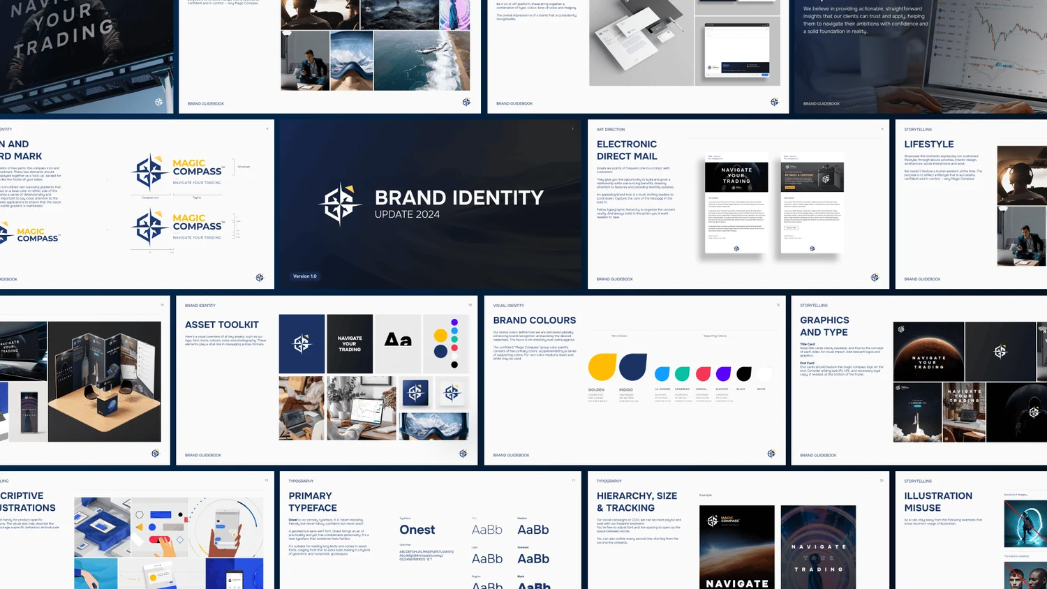
A trading brand with a distinct visual language.
- Design contribution
- Branding, UX/UI, CMS, 3D animation
- Engagement
- Employment · Magic Compass Group
- Experience period
- 2024–2025
Brand direction
Build recognition across product and campaign surfaces.
Across touchpoints
Green and yellow environments, metallic forms and product screens create a shared visual identity.
Colour system
Set the palette behind the brand’s contrast.
A repeatable foundation
Bright yellow is balanced by greens, orange and warm neutrals with defined tonal scales.
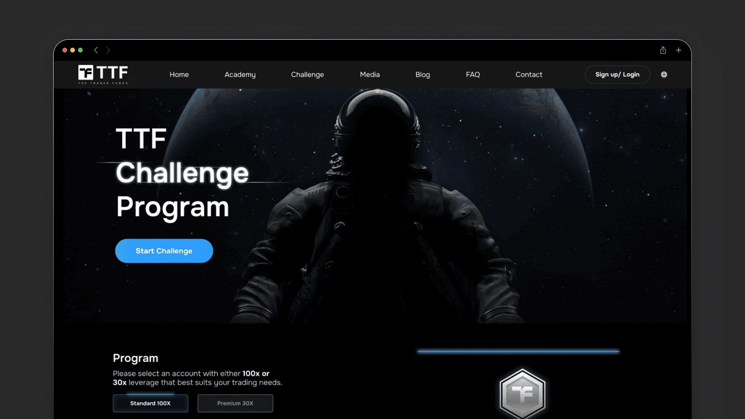
Website sections
Give each part of the offer its own visual focus.
For product communication
The studies connect dimensional artwork with concise content blocks and clear section hierarchy.
Page system
Keep the experience coherent across page types.
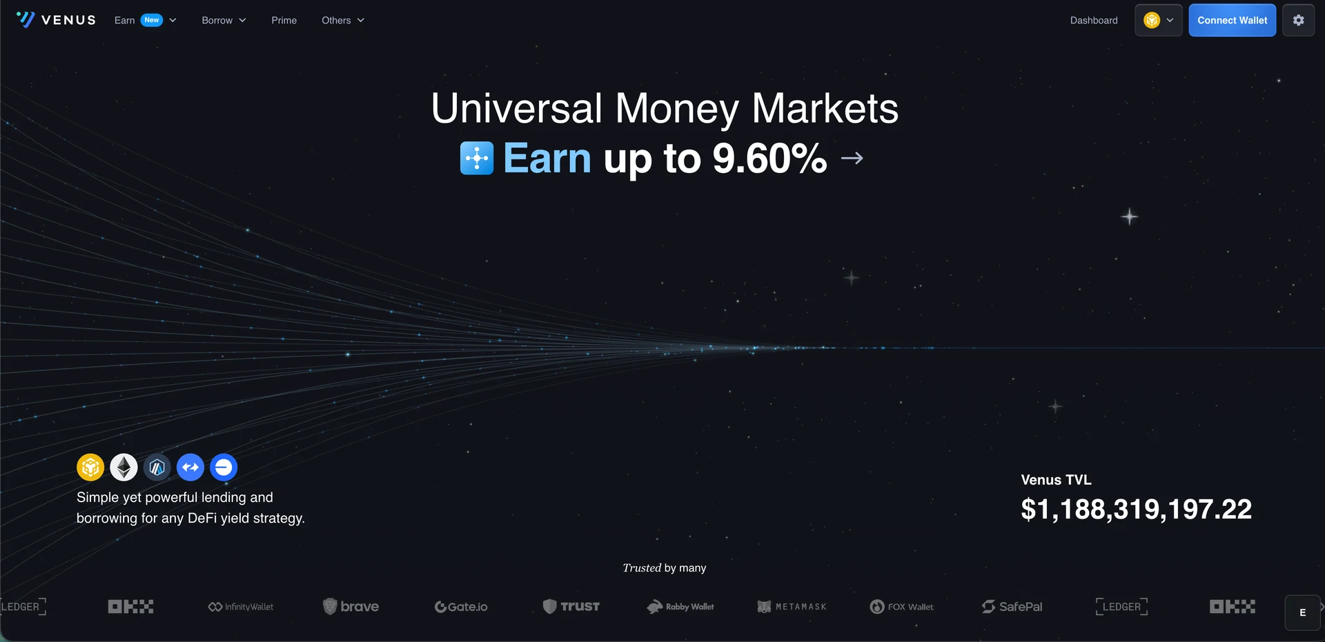
Desktop and mobile
The full set brings navigation, content panels and responsive layouts into one dark visual system.